Terminal fonts
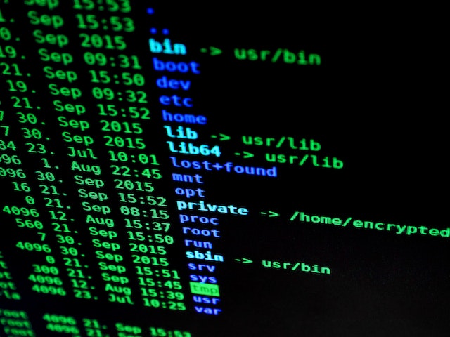
Photo by Pixabay from Pexels: https://www.pexels.com/photo/blur-bright-business-codes-207580/
Most fonts, especially the standard ones coming with Windows/Linux are awful for usage in terminal applications like PuTTY, xterm, etc. Or the reading of technical output at all. Most of them aren't optimized to allow the easy recognition of characters and symbols you rarely encounter in a written document. But do so even more in a technical environment.
I mean, when did you ever read a newspaper which had all of these characters printed in one single article?
, ; . : | * ~ ' # < > ` ´ ^ [ ] { }
Additionally, many standard fonts aren't monospaced. This means: Each single character takes the same width. No matter if letter (upper- or lowercase), number or special character. Which gives such a HUGE boost to readability (and therefore performance) that I can't stress this point enough. Comparing output/logfile lines or just spotting anomalies gets significantly easier.
Usually "Which font do you use?" is a good conversation starter (or interview question ;-) ) when your counterpart is a seasoned sysadmin or developer.
So which ones do I use?
Currently I use the INPUT font in monospaced from David Jonathan Ross.
You can get a preview here: https://input.djr.com/preview/ and play around with all the options. Then, choose the one you like and import it into your systems font catalogue.
Sadly I can't use it for this blog. As web usage isn't free. And the offered rates/prices are way too overpriced for a little blog like this. (The cheapest is literally 1000 US-$ per month. Which is absolutely no price range for personal projects..)
Before that I used the Roboto Mono font, but I found some special characters rather hard to read or indistinguishable from another. So I asked around and was recommend the INPUT font, which I now use for some years.
Other fonts I got recommended were:
- DejaVuSansMono Nerd Font Mono (from https://www.nerdfonts.com/font-downloads)
- Fonts based on IBM terminal fonts (from https://int10h.org/oldschool-pc-fonts/fontlist/)